The trends tab will show you your spending versus income over time. This can aid anyone who seems to need to borrow money frequently by showing how your spending has changed over time.
-
Graph Options
At the top of the module, you can choose to see these trends over three [3] months, six [6] months, nine [9] months or twelve [12] months.

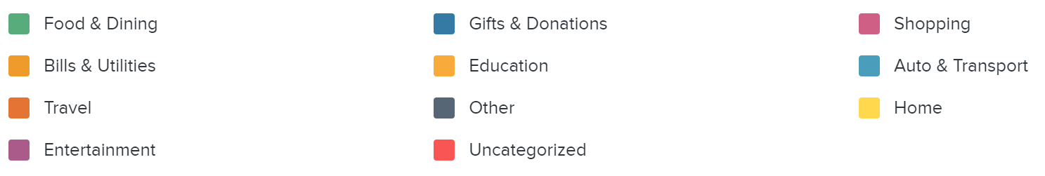
The legend for the graph is shown below, so you can see which colors correspond to which major budget category.
You can see a more focused trend over time of one specific major budget category by clicking on the colored section in the trend graph, or by selecting the category in the legend below the graph. If you have Sub-Budgets set up, you will see the trend of these Sub-Budgets over time once you select the associated major budget category. To view all the categories again, click the “<- Back to All Categories” button in the top left.

If you do not wish to see trends as a graph and would prefer a layout more akin to a spreadsheet, you can toggle to a list view. Click on the Bulleted List Icon in the top left of the module to switch to the spreadsheet layout.

You can freely choose between the two visual styles whenever you like.